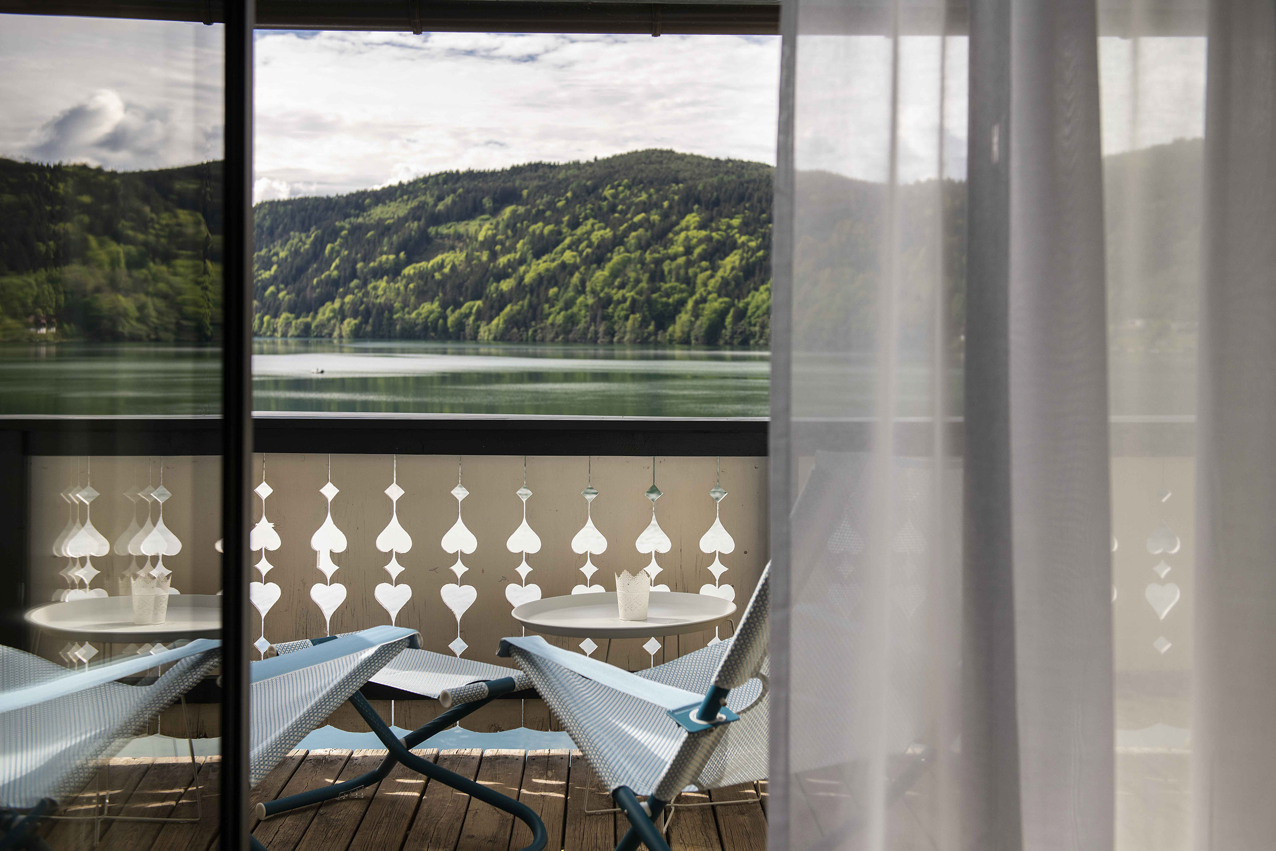
The architecture of the ensemble plays a significant role in this. It is literally the foundation and at the same time a business card, a first and lasting impression; all further impressions, the details of the design complement it. The architecture and design studio Archisphere has dedicated itself to this overall task.
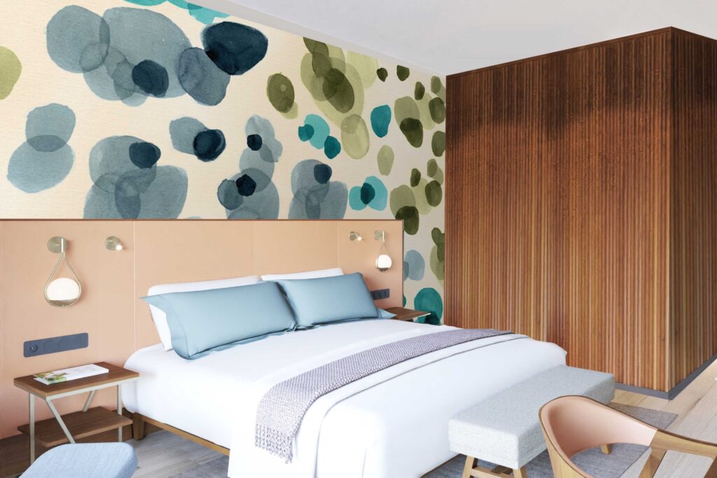
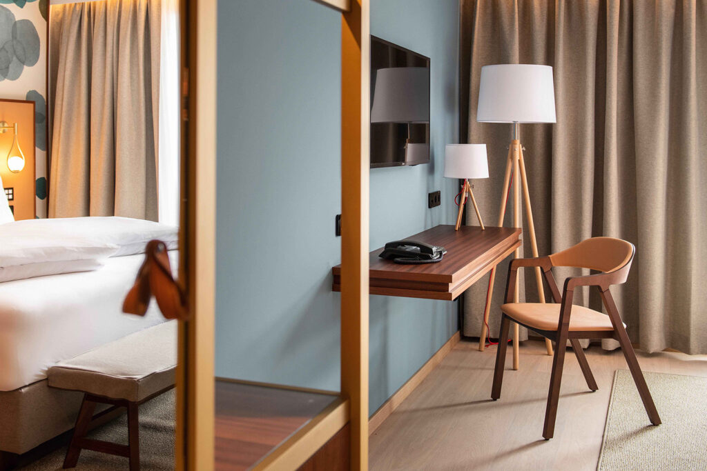
The aim was to continue the history of the "Forelle", the traditional first house on the site on one of the most beautiful Austrian lakes, and to integrate it into a vision with a promising future. The poetry of a summer resort where you can relax "like in the good old days" is to be preserved. At the same time, guests should be able to enjoy contemporary amenities regardless of the season, a new spa area above all and rooms whose furnishings radiate cosiness, regardless of whether the lake or the snow is sparkling in the sun outside. The "Forelle" is in fact becoming a year-round destination and is thinking of seasons that take place not only on the beach, but also on the slopes or precisely in relaxing interiors. It is a project in several construction phases, and even the completed first phase gives an idea of what is to come. A large new building is due in a year's time - together with the existing buildings it will contribute to a coherent overall experience. A long architectural narrative will thus find a continuation. The scale will be preserved, the Wilhelminian period will remain perceptible, and modernity will join it.
"Die Forelle - Hotel am See": a hotel under the sign of the fish, the water. This evokes very specific emotions and images. These, in turn, can be expressed in formal language and gestures, from the logo to - naturally - the menu to the appearance on the web, and also in visual stimuli that sometimes contribute to the experience in a clearly visible way, sometimes subcutaneously: materials used, colours, the quality of the light.
"Bringing the lake into the house" was the central theme of the design. The water can be seen from every room in the new wing, and just as waves gently and playfully spread out, mental associations with the lake reach the guests. Glass creates vistas and the bathroom doors with their wavy panes are reminiscent of the clear water; the stone used in the bathrooms is reminiscent of the pebbles in the lake; its proximity is further emphasised by graphic fish motifs. Clarity, health and life resonate poetically.
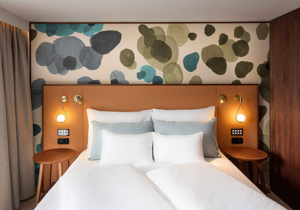
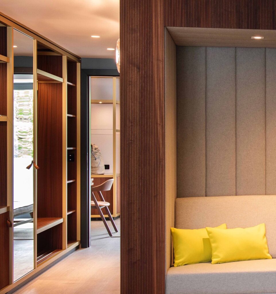
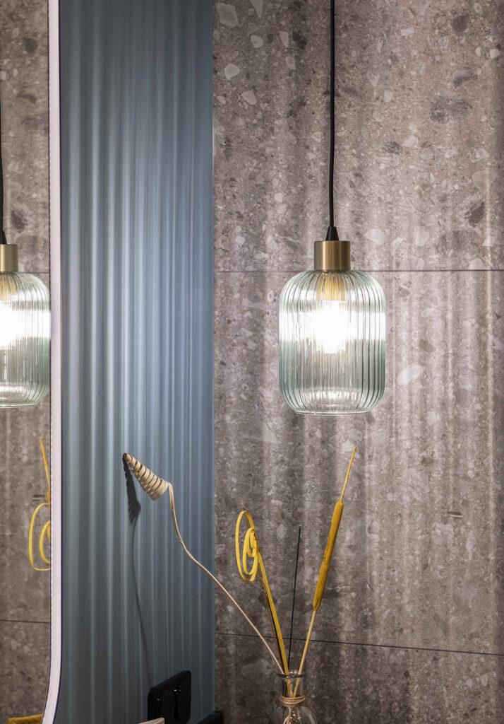
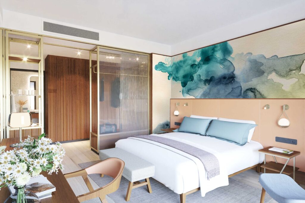
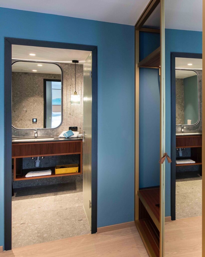
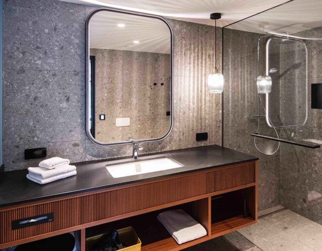
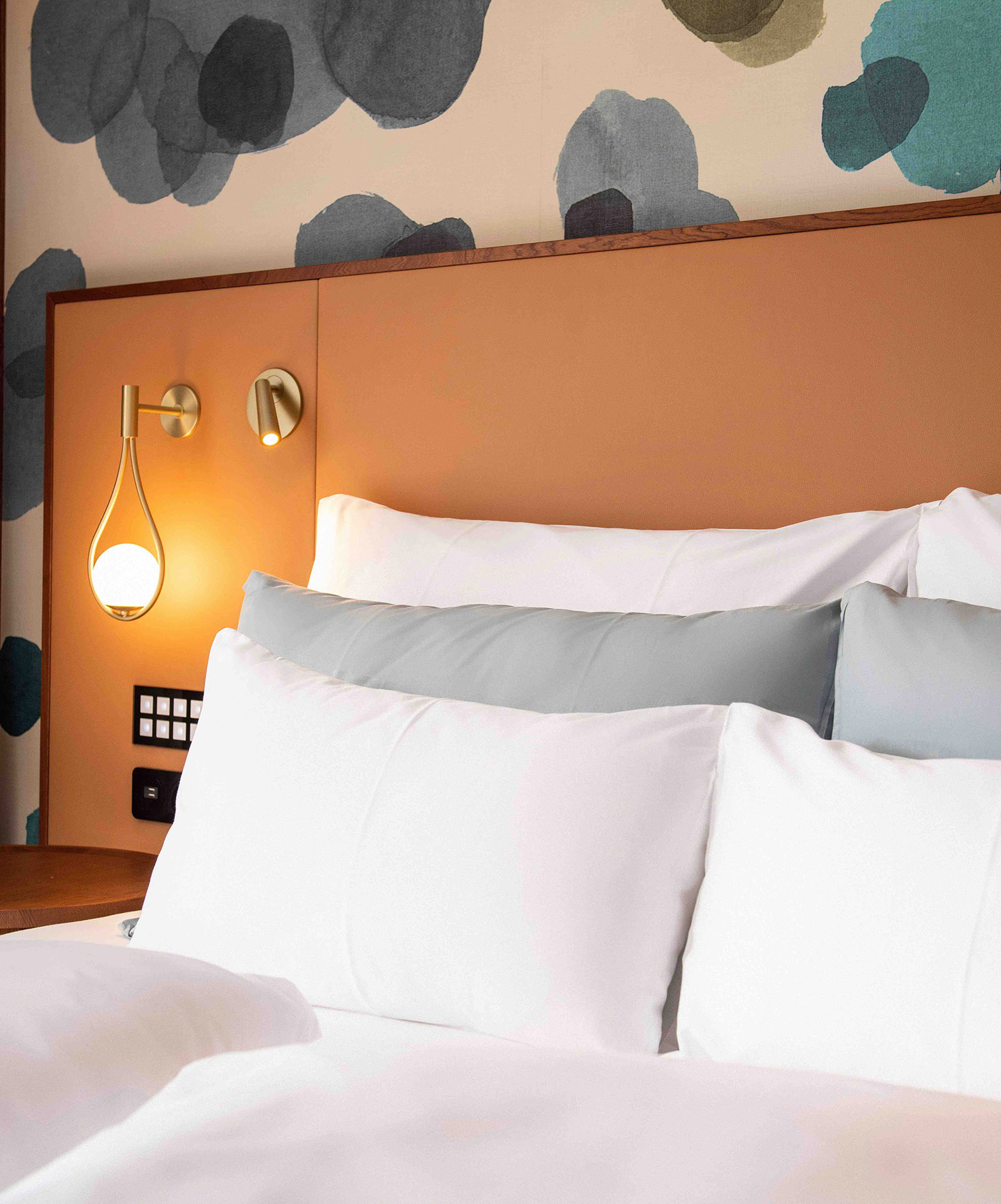
Good design literally needs to be put in the right light. The Archisphere team therefore paid special attention to the lighting in all rooms. They used direct lighting where it is needed so that guests can concentrate on food, reading or other things. Indirect light in the right colour temperature creates a pleasant, relaxed atmosphere. And colours, which only come into their own through lighting, additionally emphasise the character of interiors. The culturally anchored colour symbolism - what do we experience with certain stimuli, what triggers a sense of well-being, what stimulates or calms - has a different effect depending on how intense and how pure the colour appears. The complex interplay of materials, colours and light sources determines how a space is experienced. For Archisphere, design know-how is just as important as knowledge of basic architectural rules and the perfect technical execution of a project. The employees of the studio explore the wishes and ideas of the clients and develop a story from them, which they creatively realise.
